
Any single broadband dataset is likely to give an incomplete view of connectivity. Using information from multiple datasets simultaneously can help mitigate this problem. Drawing insights by combining multiple broadband datasets is one goal of the TPI Broadband Map.
One feature we will soon add is a “Broadband Connectivity Index” (BCI). The BCI incorporates information from multiple datasets in a way that makes it possible to compare overall connectivity objectively and consistently across any geographic areas. Specifically, the BCI uses a principal components analysis to take into account the share of households that can access fixed speeds of 25/3 and 100/25 (which we calculate by combining the FCC’s Form 477 data with the American Community Survey), average measured download speed (from Ookla), the share of households that connect at 25/3 (from Microsoft), and the share of households with a broadband subscription (from the American Community Survey).
The BCI achieves two objectives. First, it makes it possible to compare connectivity across regions (counties, in this case) in an objective way. Second, it can help identify areas that government might usefully target for assistance.
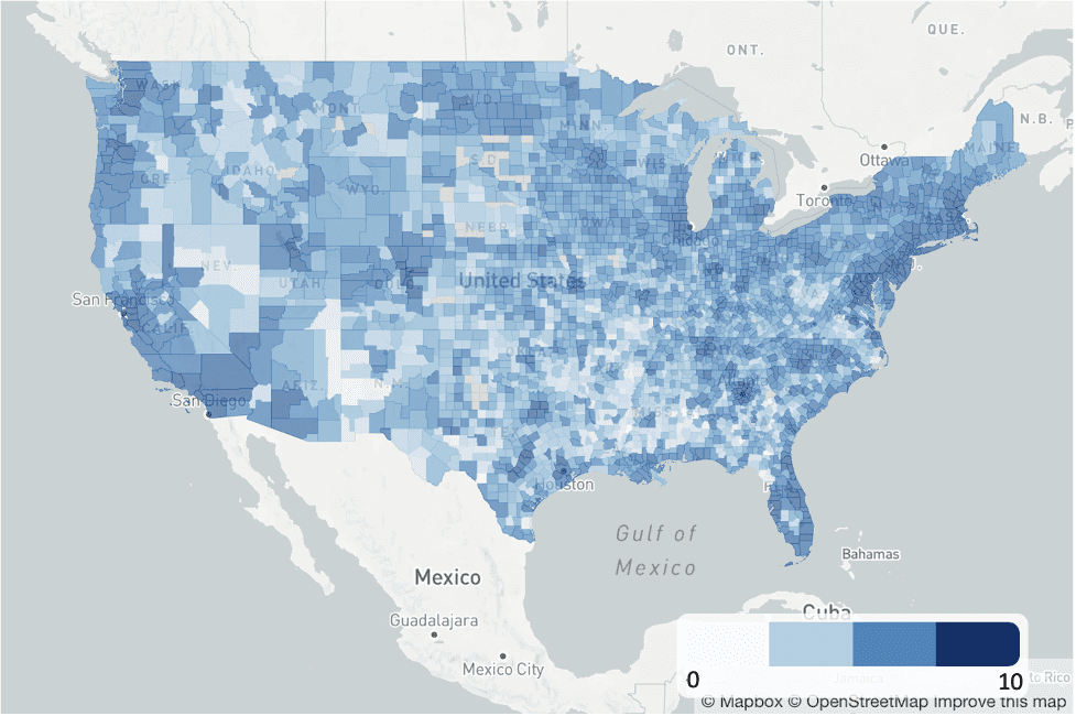
The BCI ranges from zero to ten, where zero is the worst-connected and ten is the best. In the county with the highest score, Falls Church, Virginia, 99 percent of households have access to at least 100/25 bandwidth, 100 percent of households connect to Microsoft’s servers at 25/3, the average fixed download speed is 243 Mbps as measured by Ookla in Q2 2021, and 94 percent of households have a fixed internet connection. At the other end of the scale, Echols County, Georgia, has the lowest score on the BCI. In this county, none of the population has access to a 25/3 fixed connection (excluding satellite), three percent connect to Microsoft’s servers at 25/3, the average download speed as measured by Ookla is about 7 Mbps, and 47 percent of households have an internet connection. ISPs won $3.6 million in the recent RDOF auction to provide service in areas within the county.
The figure below maps the BCI at the U.S. county level, where lighter colors reflect lower connectivity and darker colors more connectivity. Although this map shows counties, we can construct it for any geographic area that exists in all of the datasets used to create it.
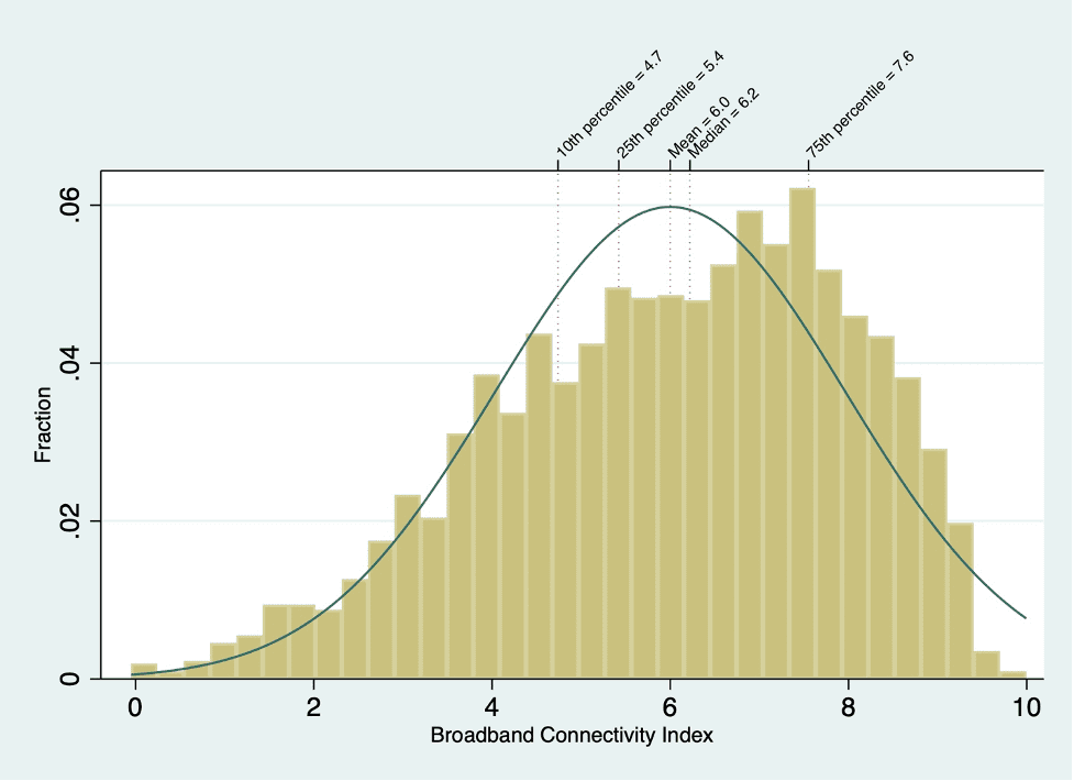
The histogram of the BCI below shows how connectivity is a distribution rather than something that is just have or don’t have.
Scatterplots show how TPI’s BCI can add nuance to data that might otherwise be construed as “wrong” or dismissed as having too much error. Rather than relying on one dataset, the BCI weighs several datasets to formulate a score. Consider the difference between relying on one dataset and on a composite score in the figure below, which plots the index against the share of households with access to 25/3 service, as calculated from the FCC’s Form 477 and American Community Survey.
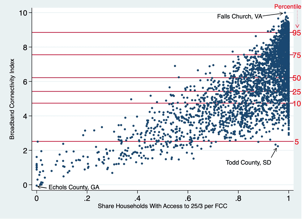
An apparent outlier highlights how TPI’s BCI can mitigate other measurement problems. According to the FCC’s Form 477, nearly all households in Todd County, South Dakota can access fixed broadband at 25/3. Other data, though, suggest that access alone may provide an incomplete view of connectivity. Average available and received speeds are relatively low, as is adoption, causing the county to have a low connectivity score despite the high share of households that the FCC reports having access to broadband.
Policymakers could use this index to identify areas that require a closer look. Perhaps any county below, say, the fifth percentile, for example, would be places to spend effort trying to understand.
We don’t claim that this index is the perfect indicator of connectivity, or even the best one we can create. In some cases, it might magnify errors, particularly if multiple datasets include errors in the same area. We’re still fine-tuning it to reduce error to the extent possible and ensure the index truly captures useful information. Still, this preliminary exercise shows that it is possible to obtain new information on connectivity with existing datasets rather than relying only on future, extremely expensive data.

Scott Wallsten is President and Senior Fellow at the Technology Policy Institute and also a senior fellow at the Georgetown Center for Business and Public Policy. He is an economist with expertise in industrial organization and public policy, and his research focuses on competition, regulation, telecommunications, the economics of digitization, and technology policy. He was the economics director for the FCC's National Broadband Plan and has been a lecturer in Stanford University’s public policy program, director of communications policy studies and senior fellow at the Progress & Freedom Foundation, a senior fellow at the AEI – Brookings Joint Center for Regulatory Studies and a resident scholar at the American Enterprise Institute, an economist at The World Bank, a scholar at the Stanford Institute for Economic Policy Research, and a staff economist at the U.S. President’s Council of Economic Advisers. He holds a PhD in economics from Stanford University.
