
A recent story in the Texas Tribune discussed how Texas’s broadband map shows service in some areas that residents say doesn’t exist. Discrepancies like those push state and local policymakers to engage in their own expensive mapping efforts to try to address such errors before distributing the tens of billions of dollars in broadband subsidies coming down the pike.
Paradoxically, to improve availability maps, a state’s (or county’s, city’s, or town’s) first step should not be to gather more availability data.
Instead, states should first turn to data–often available for free– on metrics other than availability to systematically evaluate the quality of the FCC’s availability data. The results of that analysis can then allow the state to focus data-gathering resources specifically on areas the evaluations suggest information on availability may be suspect rather than replicating the FCC’s efforts across the entire state.
In this post I discuss one method of using adoption and speed data to infer where availability data may have errors.
Maps cannot reflect reality with 100% certainty. We all know this intuitively–we’re not surprised when Google Maps doesn’t always know which streets are blocked despite receiving data from millions of phones. The FCC’s new broadband map is almost certainly the best that has ever existed, and it’s getting better all the time. Even so, it is not possible to truly know for sure that any given house can or cannot get a particular broadband technology. For example, perhaps a house lies squarely in a fiber-served area but has wiring that is too old for the residents to use fiber. A map of the area is likely to show that the house has service, but in reality it does not–at least, not without rewiring–for reasons unknown to the ISP providing the data.
The key point is that we can’t expect maps to perfectly show the state of the world. Instead, they allow us, in this case, to understand connectivity with varying levels of certainty. Sometimes that certainty is high: in some places we know the map shows accurately which locations have service and which do not. But we may know the level of connectivity in other areas with less certainty, and those are the areas like the ones in East Texas the Texas Tribune article discusses.
We can begin to resolve this issue–gain more certainty about the true conditions on the ground–by bringing more (often existing) data to bear.
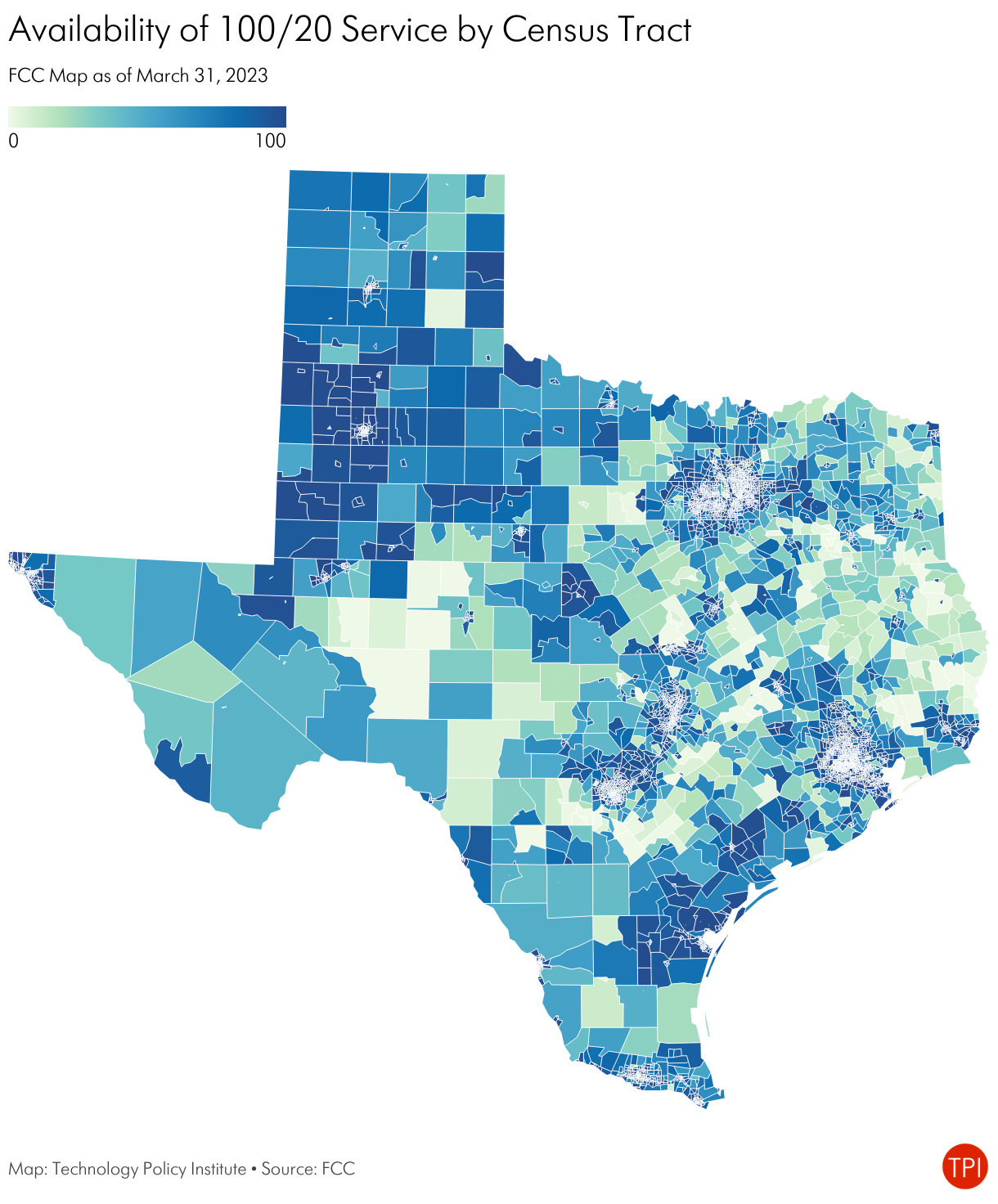
Continuing the Texas example, let’s use TPI’s Broadband data platform to check the FCC’s data using other data.
The FCC data shows 88% of locations served with at least 100/20 and 92% served with at least 25/3 service, with a lot of variability across the state.
Let’s now consider how speed tests and adoption can help verify availability data.
The maps below show broadband adoption as measured by the American Community Survey and the mean fixed speed as measured by Ookla speed tests.
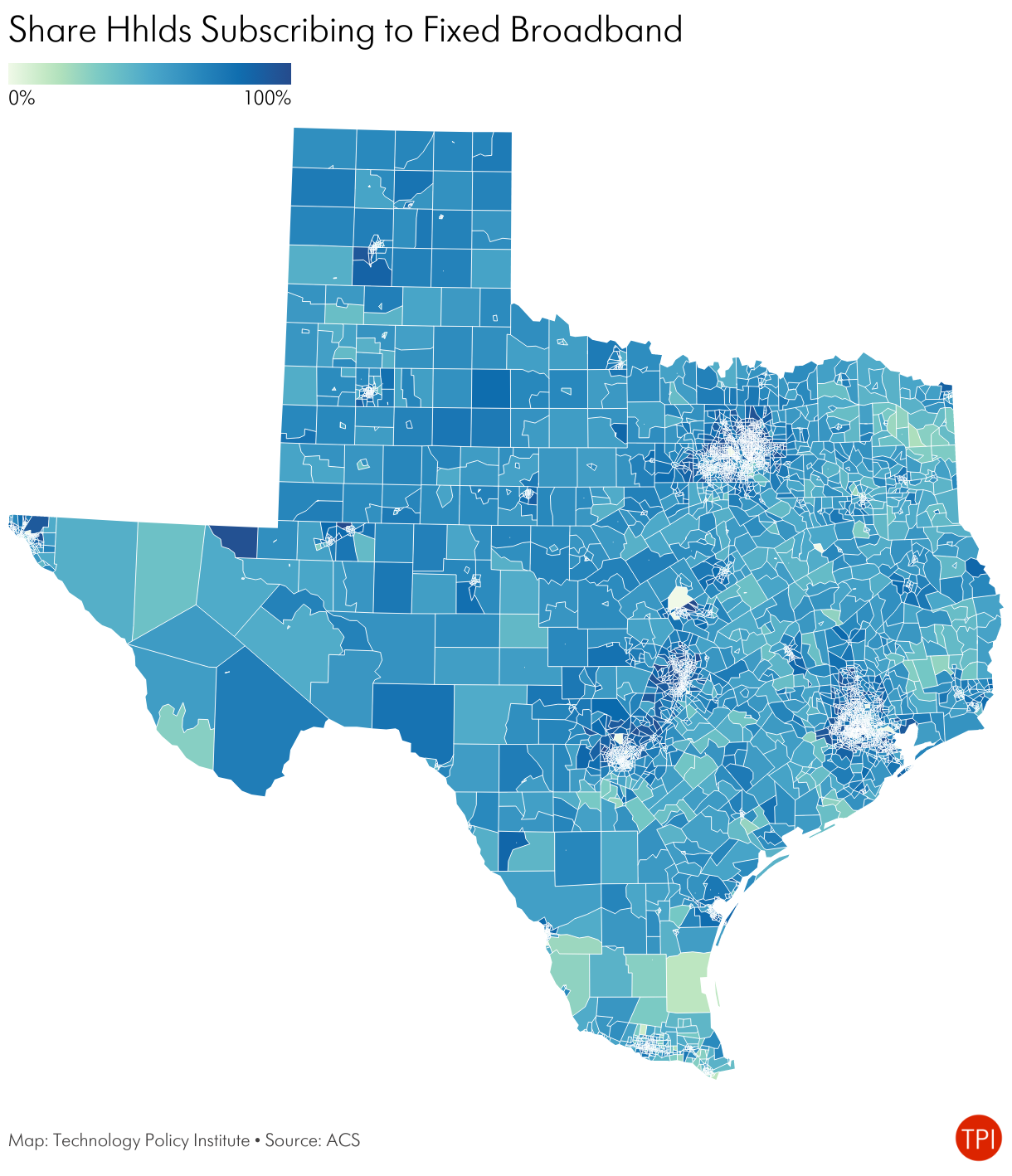
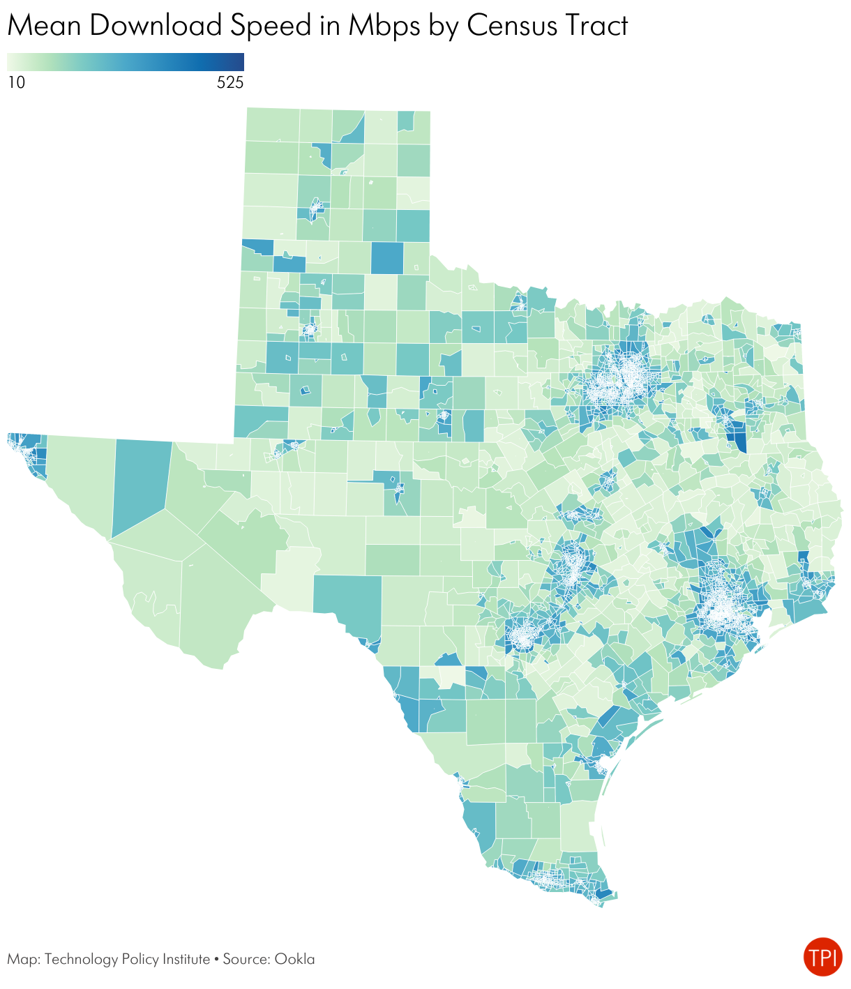
Speed, adoption, and availability data each reflect something different and do not move in lockstep. Availability maps, such as the FCC’s, generally allow us to calculate the share of locations in a given geographic area that can get at least some minimum connection speed. Speed tests, by contrast, show an intersection of supply and demand. The speed test mean or median will always be lower than the maximum available because not everyone subscribes to the highest speed. Adoption refers to broadband subscriptions. People can only subscribe when service is available, and not all households subscribe.
Availability, speed, and adoption are distinctly different measures, but they are correlated with each other. The table below shows the positive, strong correlation between the different variables.
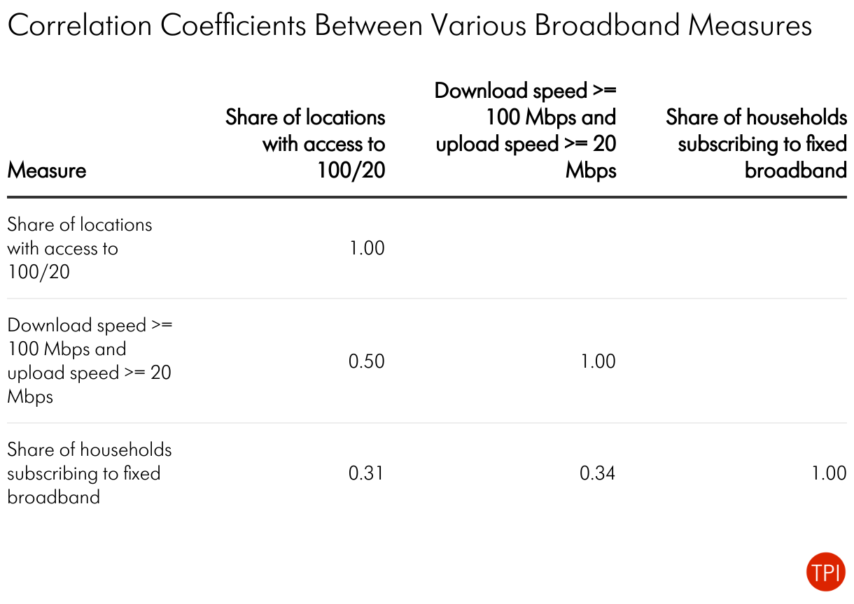
This positive correlation means that we should generally expect them to be broadly similar: high availability, high adoption, and high speeds go together. That’s only on average, of course, and the measures can differ for perfectly legitimate reasons. For example, we know that the digital divide is mostly an income-based issue, so in urban areas we expect availability to be relatively higher than adoption. Nevertheless, this correlation presents a tool for identifying possibly flawed information.
In this example, we have three categories of information: availability, speed, and adoption. We’re thinking about how infrastructure subsidies might be best spent, so our objective is to identify areas where the availability data might be flawed. If we were focused on measuring, for example, digital divide issues we could use other datasets to evaluate the ACS data.
Think of our measures as three categories of a Venn Diagram: (A) speed, (B) availability, and (C) adoption.
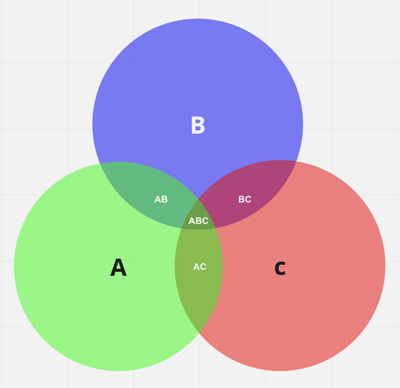
We can be most certain that the availability data is correct in regions where all the variables intersect (ABC). That is, we should have high confidence in the FCC’s data when all the indicators suggest good connectivity. On the other hand, we should have lower confidence in the FCC availability data when it intersects with neither of the other variables (A, but not AB, AC, or ABC).
At this point, you may be thinking, “but this makes no sense. What does it mean for availability and speed to intersect? They measure different things and are continuous variables.” And that’s where we have to make some assumptions about what different levels of each variable might tell us about availability.
For this exercise, we will say that the following conditions are consistent with each other:
- A mean download speed of at least 100 Mbps and upload speed of at least 20 Mbps.
- At least 75% of locations have access to 100 Mbps down and 20 Mbps up.
- At least 75% of households subscribe to fixed broadband.
Adjusting these levels can tighten or loosen what we consider to reflect consistency between the variables. For example, reducing the threshold percentages in (B) and (C) to 50% from 75% would show more areas having consistent data, and vice versa.
The map of Texas below shows the results of applying this methodology.
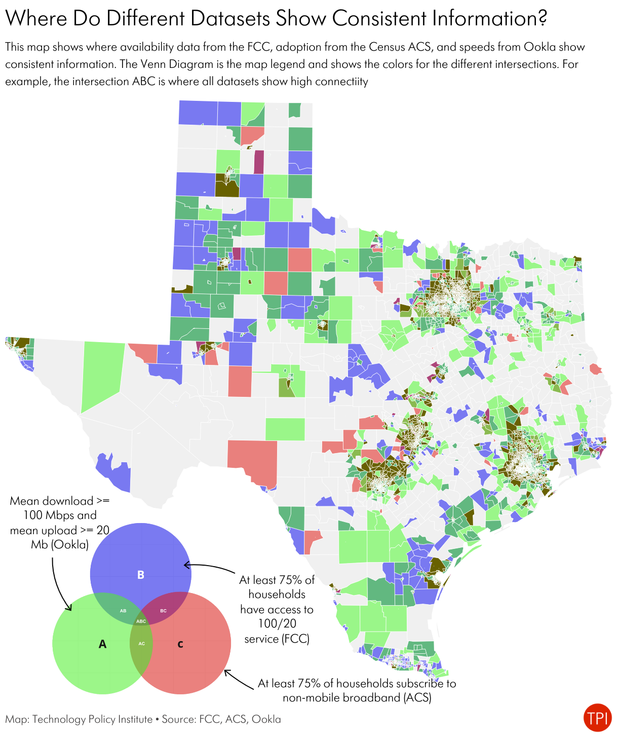
Gray shows Census tracts that meet none of the conditions–that is, all three variables show low levels of connectivity (as we defined them). In those tracts all the data show low levels of connectivity, so we can be reasonably certain connectivity is poor.
The brownish areas are where all three indicators show high levels of connectivity. At first blush, it appears to cover only a small share of the state, but those are primarily urban areas, so cover the vast majority of the state’s population. In these cases, we can be reasonably certain that connectivity is good, at least as we defined it.
The other areas show us where our level of confidence in the availability data is lower or the differences in the data let us draw other conclusions.
Purple tracts are the ones where we have low certainty about the quality of the FCC availability data. In those tracts, the FCC map says at least 75% of locations have access to at least 100/20 service, but the mean speedtest results are less than 100/20 and fewer than 75% of households subscribe to fixed broadband. It is in these areas that residents may be skeptical of the FCC map based on their own experiences.
Green areas show places that have relatively high speeds, but low adoption and low availability. In these areas it may be necessary to drill down to smaller geographic units–Census tracts can be large, especially in large western states like Texas–to see pockets of availability. Alternatively, people may have strong satellite connections showing faster speeds but would not show up as wired availability or adoption.
Red areas are those with high adoption but low availability and low speeds. In these areas people may subscribe to satellite or fixed wireless connections.
Importantly, none of these results necessarily mean that the FCC data is wrong. There are many possible reasons why all of these can simultaneously be true. The table below shows some possible explanations for the results.

The more the different datasets suggest different realities, the more likely that at least one of them is wrong. In this case, the implication is that if Texas wanted to check the validity of the FCC map it could focus its resources on the purple areas because those are the most likely to be problematic.
Of course, Census tracts are relatively large, particularly in a state like Texas, so the state would want to do this exercise at smaller geographic levels to better identify potentially problematic areas, as well as do sensitivity analyses by changing the threshold levels.
This analysis has several implications for states as they prepare to distribute BEAD grants.
- Do not rely only on availability maps to identify areas that should be eligible for funding. The FCC’s map is probably the best there is, particularly once it incorporates information from the challenge process, and every state should start from that basis. But information on factors other than availability can identify the map’s strengths and weaknesses.
- It is not necessary to spend a lot of money re-mapping the entire state. A lot of public data exists that states can use to hone in on inaccuracies. At a minimum, running these sorts of tests with public data can help the state narrow the areas in which it needs more data.
- Data analysis, not pictures, should drive the funding process.
Datasets always – always – contain errors, and the errors are worse when conditions change rapidly, as is the case with broadband availability. The FCC’s broadband availability map is almost certainly the best the U.S. has ever had, and the challenge process is constantly improving it. States and others should vigorously contribute to this process, but that does not mean additional efforts to map statewide availability will necessarily lead to better results, or at least better enough to justify the costs.
States can use existing data to test the FCC’s data and then focus additional data-gathering efforts on areas where additional data suggests the effort might yield dividends.

Scott Wallsten is President and Senior Fellow at the Technology Policy Institute and also a senior fellow at the Georgetown Center for Business and Public Policy. He is an economist with expertise in industrial organization and public policy, and his research focuses on competition, regulation, telecommunications, the economics of digitization, and technology policy. He was the economics director for the FCC's National Broadband Plan and has been a lecturer in Stanford University’s public policy program, director of communications policy studies and senior fellow at the Progress & Freedom Foundation, a senior fellow at the AEI – Brookings Joint Center for Regulatory Studies and a resident scholar at the American Enterprise Institute, an economist at The World Bank, a scholar at the Stanford Institute for Economic Policy Research, and a staff economist at the U.S. President’s Council of Economic Advisers. He holds a PhD in economics from Stanford University.